Phoenix Mercury Unveil New Bold and Modernized Brand
Redesigned Logos and Wordmarks Usher in Next Era of Mercury Basketball Ahead of Franchise’s 30th Season

PHOENIX – The Phoenix Mercury today introduced a new modernized brand look with redesigned logos and wordmarks that celebrate the legacy of the past and embrace the future – ushering in the next era of Mercury basketball with the team’s first-ever rebrand. To celebrate the launch, the Mercury will host a Merc Merch Swap, a first-of-its-kind community giveback initiative that offers fans an opportunity to trade in merchandise for a Mercury T-Shirt with the new logo.
“The new branding represents the Mercury’s championship legacy, devoted fanbase and the new era that began with a record-breaking season and memorable Finals run,” said Phoenix Mercury and Phoenix Suns Chief Executive Officer Josh Bartelstein. “While our logos have been reimagined, the Mercury’s identity remains the same – our organization’s commitment to the community and the grit and joy of our team will continue to define Mercury basketball.”
The primary logo is an evolution of the iconic Mercury “M,” positioned at an angle of 19.97 degrees, a reference to the Mercury’s inaugural season. The crescent shape echoes the shadowed side of planet Mercury and introduces a prominent splash of purple. The sharp right corner of the “M” serves as a nod to the original geometric rings, symbolizing an arrow to the future and forward momentum of the franchise.
The global logo features the primary emblem at the center, with four rings positioned behind it, mirroring the planetary rings on the team’s original design. The “M” divides the four rings into eight individual lines that symbolize the Mercury’s status as one of the eight original WNBA franchises.
For the first time ever, the Mercury has added a secondary logo. The mark features the outline of Arizona with seams of a basketball to celebrate the state as the epicenter of basketball and the team’s dedicated fanbase. The logo also includes the official introduction of the popular “Merc” moniker into the branding, a nickname players and fans have long used to refer to the team.
The Mercury’s brand toolkit also consists of a revamped PHX alternate logo which was first introduced in 2021 on the Rebel uniform. The “X” highlighted in bright orange celebrates the X-Factor, the most avid fanbase in the WNBA whose nickname was coined by Cheryl Miller, the team’s first head coach and general manager. The new wordmarks were created in an original and modern “Mighty Mercury” typeface and feature a slightly curved baseline symbolizing the horizon on Planet Mercury.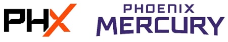
The Merc Merch Swap is taking place now through Dec. 5 at the Team Shop at Mortgage Matchup Center. Fans can exchange any Mercury, WNBA or WNBA team merchandise for new Mercury merchandise. Apparel collected will be donated to Goodwill, a partner of the Phoenix Mercury. Fans who participate in the merchandise swap will also receive a voucher for 20% off a new Mercury item.
Mercury apparel and hats featuring the new branding are now available at the Team Shop and online at shop.phoenixmercury.com.
For additional rebrand design details, visit phxmerc.com/newlook.
,xPosition=.5,yPosition=.5)
,xPosition=.5,yPosition=.5)
,xPosition=.5,yPosition=.5)
,xPosition=.5,yPosition=.5)